October 15, 2024
In this post, Stone Center Senior Scholar Branko Milanovic examines the effects of Covid-19 and the return to “normalcy.” The post originally appeared in his Substack, Global Inequality and More 3.0.
By Branko Milanovic
The period of the past five years was a peculiar one as far as inequality changes are concerned. This was due principally to the effect of Covid and related government policies that were felt strongly in 2020 and 2021. By 2022, things got “normalized” and rebounded more or less back to pre-Covid trends. Another change was the retreat from globalization, at least in rhetoric and somewhat in fact. However, it is still too early for that effect to be seen in income distribution data.
I will consider here the changes in the three biggest economies: China, the U.S., and India. The data for many countries are being systematically compiled and displayed on the World Bank’s Poverty and Inequality Platform (PIP), and by the Luxembourg Income Study (LIS). Both are public and relatively easily accessible. We currently have income distribution data for 2021 through 2023 for about 90 countries, representing 85 percent of world GDP and 75 percent of the world population. However, it is still too early to make broader conclusions regarding global inequality, because the data from many African countries are missing, as are income-based microdata for China. Within the next six to nine months, I think we shall have both, and we will then be able to say more about the most recent evolution in global inequality.
Now, let’s go to the three countries.
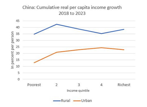
China. Consider first what happened, according to the official (and fairly limited) data published by the National Bureau of Statistics, to Chinese rural and urban incomes by income quintile between 2018 and 2023. These summary data come from the national-level household survey, whose microdata are normally not released (although a sample from them, called the Chinese Household Income Project or CHIP, is regularly provided to LIS). Figure 1, below, shows cumulative real income changes for the five rural and five urban quintiles. In the case of urban quintiles (red line), we observe generally higher income growth for the higher quintiles. The lowest urban quintile experienced the lowest growth. This was already noticeable for several years in a row and it is not a surprise. There are two possible explanations. First, the unskilled part of the urban income distribution was particularly badly affected by the switch to a more virtual economy during Covid. Another explanation is that the lowest income group in urban areas is composed of recent migrants from the rural parts of China and, if we had longitudinal data, the actual increase in real income for them as individuals would be greater than what we see when we compare the bottom quintile as such between the two years (i.e., compare very different individuals). To add a further complication, it is not clear if the surveys always include the migrants when they do not have hukou, the famous resident permit. The second hypothesis assumes that the surveys do so, or at least do it more than in the earlier years.
Figure 1.
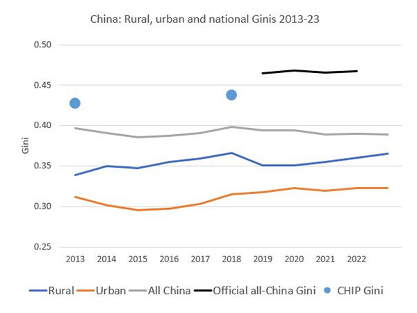
Urban Gini increased mildly by about 1 Gini point, and is now at the level of about 32 points. What is remarkable in China is that urban inequality remains lower than rural inequality. This is highly unusual.
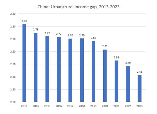
When we look at rural incomes between 2018 and 2023, we note that they have increased more or less equally among the quintiles, but importantly, for each individual quintile, the growth in rural areas has been stronger than in urban areas. The cumulative growth in rural areas has been about 35 percent over five years, and in urban areas around 25 percent. Thus, the policies whose aim is to eradicate absolute rural poverty, and to reduce the gap between urban and rural areas that has historically been large in China, seem to be showing some results. The latter can be seen in the data for the urban-rural gap which has been steadily decreasing during the past ten years (see Figure 2, below).
Figure 2.
What does all of this mean for overall national inequality? It has stayed remarkably stable. If one calculates Gini from the government-provided quintiles, the national Gini is around 40 (see the gray line in Figure 3, below). The government official Gini index is around 47 (black line), although the number for 2023 was not published. The difference between 47 and 40 is explained by the fact that the higher number is obtained using microdata, while, as I mentioned, our calculations are limited to the five quintiles — which, by definition, ignore all other variability. China Household Income Project (CHIP) data (which are microdata-based), shown as dots in Figure 3, give a Gini of about 44.
What can we make of this plethora of China’s Ginis? I think that we can conclude that inequality in China is between 45 and 47 Gini points (as we shall see below, this is significantly higher than U.S. inequality), and that it has been stable over the past decade, yet both rural and urban inequalities, considered separately, had shown a mild tendency to go up. But the gap in mean incomes between the two areas has been reduced, and that has offset the pro-inequality movement in each of them separately. The overall inequality thus stayed more or less unchanged. This last point is perhaps important to make in order to realize that overall inequality is the composite of differently sliced partial inequalities, so even a fixed overall inequality does not imply that complex and important movements in other inequalities have been absent.
Figure 3.
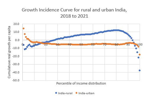
India. We move next to inequality in India, using here consumption data provided by the World Bank PIP. Indian data are a story of its own. No government-sanctioned data have been provided since 2011, and thus the World Bank has had to use consumption-based data obtained from commercially fielded surveys. (The results from the official national survey for 2022-2023 have not yet been fully released.) This is far from ideal. For many reasons, commercial surveys fall short of the standards followed by government-fielded surveys. But we have nothing better. Moreover, Indian data end in 2021, which is also unfortunate, because the effects of Covid were still felt at that time. Figure 4, below, gives the Growth Incidence Curve (GIC) for rural and urban areas. This is the same idea as in the figure for China, except here we have access to the microdata and thus the curve is much more detailed: it gives real growth rates for all consumption percentiles.
What do we find? The bottom quarter of the rural population had negative growth between 2018 and 2021 (blue line). For the rest of the rural population, growth was positive, except (perhaps somewhat surprisingly) for the top 5 percent. Overall, the rural Gini had remained where it was: about 30-31. For most of the urban population (red line), growth was negative. The average annualized rate of growth in the rural areas was around zero, and in the urban areas minus 2% . We may compare this with the average growth rates in China: in rural areas, 6.7% per annum, in urban areas, 4.1%.
Figure 4.
U.S. Finally, how did inequality behave in the U.S.? Here we have detailed and consistent annual data for up to and including 2022. They come from the harmonized LIS data, and are based on the U.S. Current Population Survey, fielded annually. The results are quite dramatic. Consider first the GIC of 2019 to 2020 (the blue line in Figure 5, below). It is downward-sloping throughout: income change in the first year of Covid was extraordinarily pro-poor. This was the most pro-poor change in any one year for the past half-century, if not more. It was due to the stimulus package, which was extremely broad (meaning that in various forms it helped all kinds of people: from the chronically unemployed to the temporarily unemployed, from students to small business owners, and even large segments of the middle class). My guess is that it provided additional income to the bottom two-thirds of the U.S. income distribution. And indeed one can notice that real income in 2020 went up for everybody but the top decile.
The black line (2018-2022) covers the entire four-year period. Its story is entirely different. The anti-Covid policies of 2020 were not repeated. Here we see that the cumulative growth over four years was around 9 percent, practically the same for the entire population except for the bottom, as well as the top 1 percent, whose growth was less (4 percent).
Figure 5.
These rather abrupt shifts in policies were reflected in what happened to the U.S. Gini. The most extraordinary development was in 2020. Market income inequality, which measures inequality before government transfers and direct taxation, increased by 1.5 Gini points. This is not surprising: the effect of Covid on the employed — absent government intervention — would have been negative, and indeed the sharp increase in market income inequality shows what the true effect of the pandemic was without the intervention of welfare state. But the welfare state intervened strongly in 2020, and disposable income Gini was reduced by 1.5 points. This was, as I mentioned, a reduction of historic proportions.
To appreciate it even better, note that 1.5 Gini points increase in market income inequality and 1.5 Gini point decrease in disposable income inequality mean that the effect of the stimulus was to reduce Gini by 3 points. This is quite unprecedented, and when I looked at the U.S. data over the past fifty years there was not a single year with such a big pro-poor change. If you want to annoy your liberal friends, you can tell them that the most inequality-reducing policies in the past half-century took place during the last year of the Trump administration.
By 2022, everything was back to “normal.” Market income Gini was 55, exactly where it was in 2018 and 2019, and disposable income Gini was 41, again exactly the same as in 2018 and 2019. Was it a tempest in a teapot? In some sense yes, because it left no marked longer-term effects on the U.S. income distribution. The programs were all of the one-off kind; they did not create durable tools or institutions for the reduction in poverty or improvement in income distribution (nor was this their objective). On the other hand, one can see it as the evidence of the huge power that a rich welfare state has: it can, by fiat, move the distribution by 3 Gini points in a year. Three consecutive years of such shifts would erase one-quarter of U.S. inequality. Thus the lesson may be that the state is very powerful — when it wants to use that power.
Is there an overall conclusion? The effects of Covid were noticeable in all three countries, but also temporary. By 2022, the U.S. and China had returned to their “normal” trends, which in both cases are a broadly stable overall inequality, and so probably did India. Fundamentally, the epidemic did not change anything.
Read More:


