
In this blog post, the former director of the SCF uses the latest data to step beyond the usual summary statistics to chart the changes in wealth and income, revealing important distributional shifts.
By Arthur B. Kennickell
When the 2019 Survey of Consumer Finances (SCF) data came out at the end of September, I immediately grabbed the file and began putting together my usual library of distributional statistics for income and wealth. I was particularly interested to see the progress of economic recovery for U.S. households since the 2008 financial crisis. That work is my focus here.
A lot of attention is usually focused on high-level statistics to describe households, such as the mean and median levels of income and wealth, often broken out by demographic groups. While that exercise is helpful in getting a broad sense of the data, it does not give a clear picture of the extent of variation in the changes over time for the population, or for individual groups, for that matter. A favorite device of mine is a graphical analysis of changes over time across the entire distribution. This note briefly explains this methodology and shows the recent results.
First, I extracted data on wealth and income from the triennial SCF from the earliest year for which comparable data are available to the latest: the 1989 survey to the 2019 survey. “Wealth” here means total assets that are under the control of a household, minus all the household’s debts. “Income” includes all before-tax income reported on a 1040 tax return, plus some types of social support (such as SNAP, for example) not captured there. Neither income nor wealth is adjusted in any way, except for an adjustment for inflation, using an index (CPI-USR) created by the Bureau of Labor Statistics to project current methods of price level adjustment back in time.
Next, I sorted the income and wealth data for each year, from the lowest to the highest, and marked the percentile value for each value. Here, I skip over some technical details, such as adjusting for sample weights. Having identified all the percentile points for both income and wealth, I can then look at changes in the inflation-adjusted level at each percentile point.
To focus most clearly on the post Great Recession period, I show here results for the survey years from 2007 forward. This gives a picture of change from just on the cusp of the crisis up to last year. No doubt, Covid-19 has wreaked further financial havoc on many. For the two sets of comparisons below, I use data from 1989 as a baseline in order to give a sense of longer-running change.
Figure 1 (below) shows the inflation-adjusted change in wealth, relative to the 1989 level, at each percentile point across the distribution. It is important to note that these changes are not changes for specific individual households — households can and do move around in the distribution over time. Much can also be said about that, but it is not my point here. This figure also omits households with wealth below the 15th percentile. While there are some very important changes for that group over time, this method is not the best way to show them — percentage changes around zero wealth are problematic and the noise in the great range of negative wealth makes interpretation difficult. I have included below a simple graph (Figure 2) to give some of the dynamics of this part of the population.
The light blue line in Figure 1 shows the percentage change in household wealth relative to the 1989 value at each percentile point. The top of the distribution experienced very strong growth — not surprising, in light of trends in wealth concentration. But for the group of households between the 25th and 95th percentiles, there was a broadly shared increase of around 60 percent. There was even stronger change below the 25th percentile. Then came the financial crisis.
Figure 1: Percent change relative to 1989 in inflation-adjusted wealth, by percentile of the distribution of wealth; 2007, 2010, 2013, 2016 and 2019 SCF.
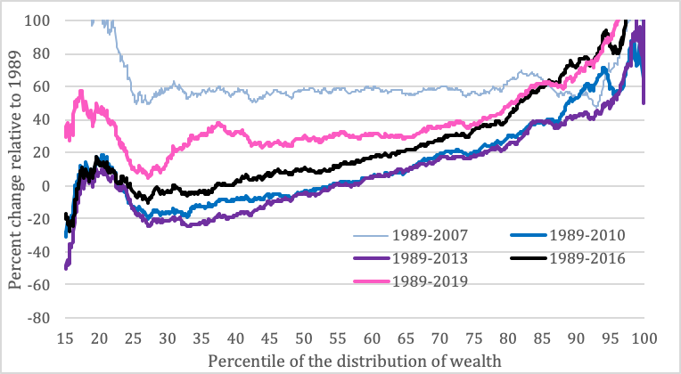
By 2010, three years after the financial crisis (darker blue line), wealth had fallen across the spectrum. For example, the cumulative wealth gains of households at the median (the 50th percentile) had fallen to about zero, relative to 1989. But what is most striking, when looking at the changes this way, is the progressively greater decline from the top toward the bottom — it’s as if a support had fallen out from one side. For the group below the median and above about the 20th percentile, there were actually substantial losses relative to 1989 — nearly 30 years of growth, gone. By 2013 (purple line), things were no better in most cases, and significantly worse in some. By 2016 (black line) there was some noticeable recovery, with those at the top progressively outstripping their 2007 position. But for others, it was more of a parallel shift upward of the slanted line, with the 25th percentile moving back only to about zero loss relative to 1989. The most recent data (pink line) show far greater growth at the top (truncated in the figure to make the rest easier to see) and a somewhat more broadly shared recovery. But even at this point, the broad center of the distribution had recovered only about halfway to the level of 2007.
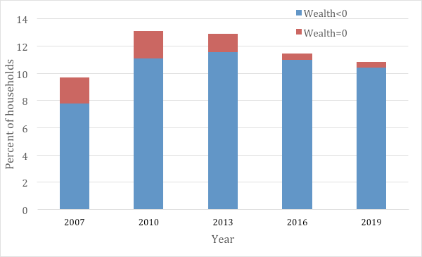
To get a general sense of what happened in the wealth distribution below the 15th percentile, it is helpful to consider the fraction of households with zero or negative wealth. In 2007, slightly fewer than 10 percent of households had zero or negative wealth; the situation back in 1989 was roughly similar. In 2010, following the financial crisis, the data show a large jump in the share with negative wealth. Although the share with zero wealth declined subsequently, the share with negative wealth was still not very different from the post-crisis level. There is a lot more to be said about compositional changes for this group, but I will defer that to a later time.
Figure 2: Percent of households with zero or negative wealth; 2007, 2010, 2013, 2016 and 2019 SCF.
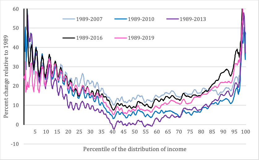
In Figure 3, we can apply the same graphical technique in Figure 1 to look at changes in income. One problem in a relatively small sample such as the SCF results from the “heaping” of income values around round numbers; the inflation adjustments cause some “wiggles” in the results, as identical nominal values are adjusted. I have chosen here to do only a little light smoothing of the results to avoid tampering significantly with the overall picture.
A different picture emerges here. Relative gains from 1989 to 2007 (light blue line) show a “valley” pattern, with stronger growth for both the bottom and the top of the distribution. Still, for the region from the median to about the 95 percentile, gains were substantial and in a similar range. Following the crisis (darker blue line), previous gains evaporated for all except the two ends of the distribution. During the following years up to 2013 (purple line), the data show further deterioration for the middle and lower-middle classes. It is especially striking that the group around the median had lost the most: they were pushed back to 1989 income levels. In 2016 (black line) and 2019 (pink line), the lower 80 percent were at or closer to their 2007 level of gains, while the upper 20 percent experienced substantial gains over the 2007 level.
Figure 3: Percent change relative to 1989 in inflation-adjusted before-tax income, by percentile of the distribution of before-tax income; 2007, 2010, 2013, 2016 and 2019 SCF.
Given the observed patterns of wealth and income changes, it would be surprising if broadly middle-wealth and middle-income households were not feeling left behind. Addressing the concerns of these households will surely be important for reaching a better place of social solidarity and progress.
About the Author:
Arthur B. Kennickell is an independent researcher and a Stone Center Affiliated Scholar. For more than three decades, he was at the Federal Reserve Board, where he directed the Survey of Consumer Finances.