
Stone Center Affiliated Scholar Arthur Kennickell worked for more than three decades at the Federal Reserve Board, where he is best known for developing and leading the Survey of Consumer Finances. This is the second in a series of three blog posts by Kennickell, which together give a broad overview of the measurement of personal wealth, largely through household-level surveys, and the use of such data to gauge inequality.
This second post examines what we mean when we talk about wealth inequality. (The first focused on the definition of wealth, and the third will look at questions related to wealth measurement.) The series was written for the recent launch of the GC Wealth Project website, aimed at expanding and consolidating access to the most up-to-date research and data on wealth, wealth inequalities, and wealth transfers and related tax policies, across countries and over time.
By Arthur B. Kennickell
Taken at its most literal level, inequality implies that for at least two of the elements compared — households in the current case — there is a “greater-than/less-than” relationship between them. But this characterization is so neutral as to be almost useless for most purposes of discussion or analysis. Many potential conceptual frameworks are used to speak of inequality. For example, should the focus be on a point-in-time measure or a broader, possibly lifetime, measure? Should the focus be on inequality of opportunities or inequality of outcomes? Given the choice of a specific framework, there is the question of how to summarize or display the relationship.
The simplest data display is the cumulative distribution of current wealth, with the level transformed to be manageable by using such a transformation as the log or inverse hyperbolic sine[1], for example as shown in Exhibit 3 for 2007 wealth using the latter transformation. This type of plot is helpful for seeing the range of values, but it is only one step beyond looking at the raw data and doing so in a form that makes further analysis difficult. The Lorenz curve, the cumulative share of wealth against the rank in the distribution, transforms the data in such a way that allows wealth shares for various groups to be read from the exhibit. For example, Exhibit 4 shows the Lorenz curve for wealth from the 2013 SCF, where the minimum value of wealth has been set to zero for convenience. There it is obvious, for example, that the wealthiest 10 percent of households owns about three-quarters of total household wealth. Such information is often summarized from the data as plots of shares held by different groups, as shown in time series for in Exhibit 5 for the years 1989 to 2013. Looked at in this more summarized way, it is much more straightforward to identify the large shifts in the wealth distribution over time.
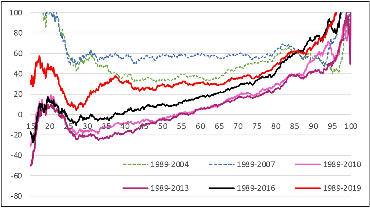
An alternative display that gives deeper insight into distributional shifts across time is the percentage quantile-difference plot, the percentage change between two years (or other marker) in the inflation-adjusted values of the distribution at each quantile of the distribution. For example, Exhibit 6 shows the distributional shifts of the wealth distribution in percentage terms relative to 1989 values (the earliest year of comparable SCF data) leading up to and after the Great Recession. As in Exhibit 15, which will appear in the final (third) post of this blog series, this exhibit is truncated at the bottom of the distribution to avoid showing the high level of noise in this approach in that region. The exhibit shows wealth had risen substantially across the broad middle of the distribution up until 2007, though there had been disproportionate growth above and below that range. The next measurement, in 2010, shows the aftermath of the Great Recession: a progressively greater decline across the part of the distribution below the 90th percentile. Recovery was slow; by 2019, the latest SCF data available, the group had only begun to approach the level of gains achieved by 2007.
[1] The inverse hyperbolic sine has the convenient property of being approximately logarithmic above zero, approximately the negative of the logarithm of the absolute value below zero and approximately linear around zero.
Exhibit 3: Cumulative distribution of wealth, 2007 SCF, inverse hyperbolic sine transformation of levels
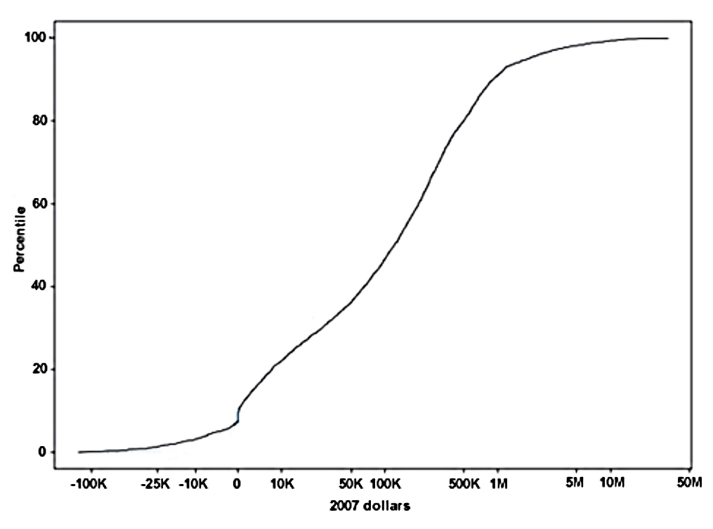
Exhibit 4: Lorenz curve for wealth, 2013 SCF
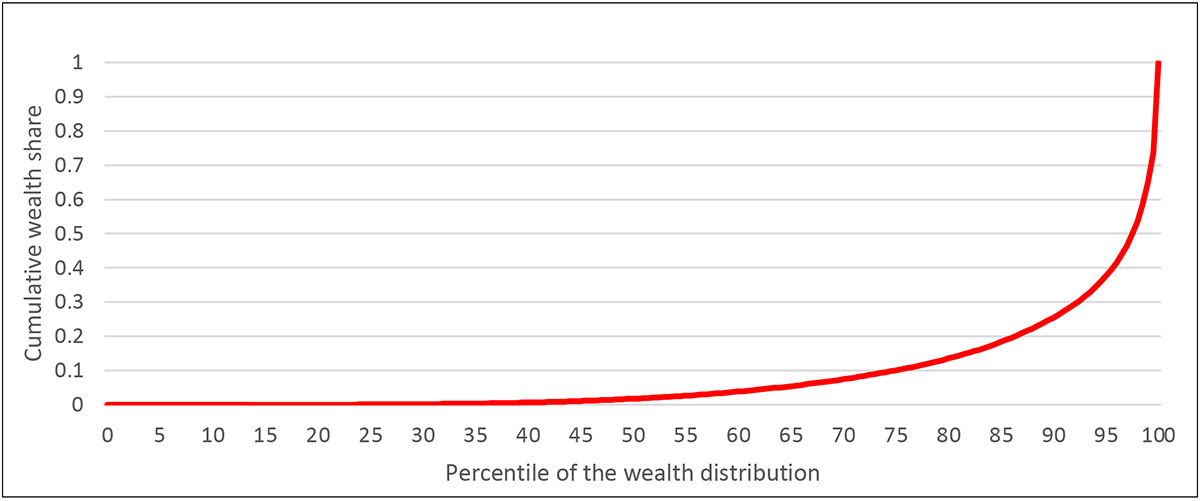
Exhibit 5: Percent shares of total wealth, by percentile groups, 1989–2013 SCF
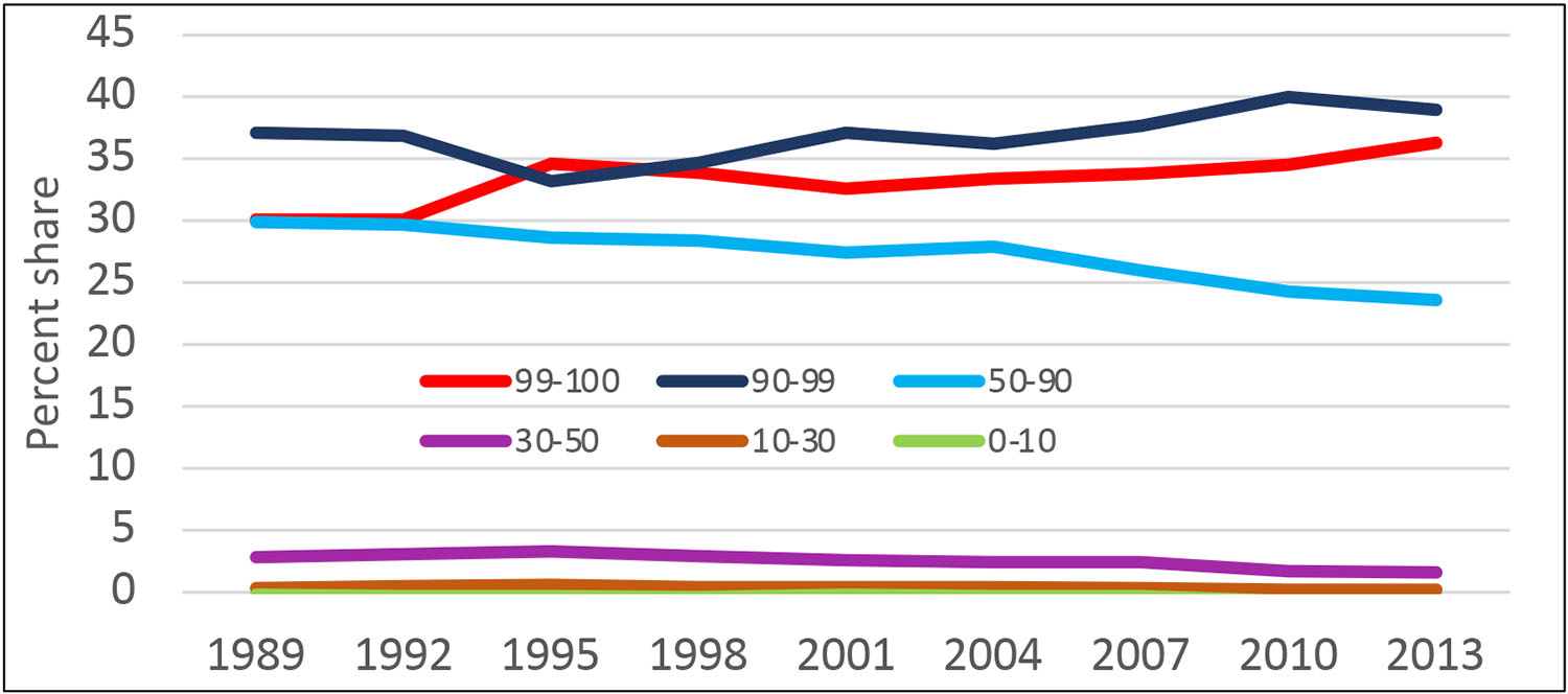
Exhibit 6: Percentage quantile-difference plots, inflation-adjusted wealth relative to 1989 values, selected years
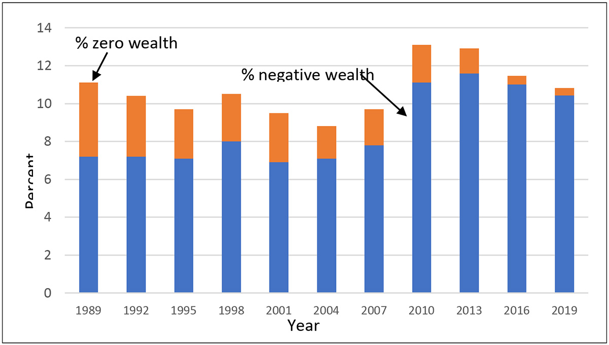
The bottom of the wealth distribution is often hard to characterize. As noted already, there is much clustering around zero wealth. But even within the group with more substantially negative wealth, there is great heterogeneity, including people with large under-water investments, young people with large student loans and few assets, and people who appear to be poor longer term. To round out the picture given by Exhibit 6, Exhibit 7 shows the percent of people in the years from 1989 to 2019 who have zero or negative wealth. The jump from 2007 to 2010 in the share of households with such wealth and the slow decline afterwards mirrors the pattern in Exhibit 6.
Exhibit 7: Percent of households with zero or negative wealth, 1989–2019 SCF
A variety of other summary measures of inequality are also available that produce a single number as a result: for example, Gini coefficient, Atkinson measures, generalized entropy, and others. It is important to keep in mind that implicit in any such summary is some ordering of importance of regions of data or relationships across ranks of data. For that reason, different summary measures may give different impressions of inequality. The plots and summary statistics may also be applied for looking at subgroups or comparisons across them, such as education or racial groups.
Interesting as these plots and summary statistics may be, they describe only relationships within (or across) distributions, not individual households, a point often overlooked. Thus, applied in the usual way, they may be less useful in describing inequality in a sense that smooths over short-term fluctuations or looks at longer pathways. Panel data are needed to address such estimates. There are many methodological issues around the collection and use of panel data, which I largely skip over here.
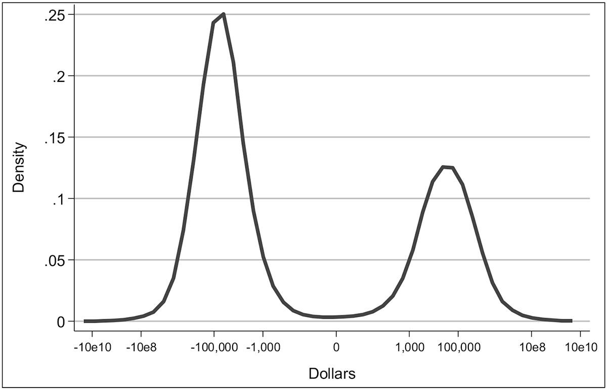
As an example of wealth variability over time, Exhibit 8 shows a copula distribution of wealth for 2007 and 2009, the time of the Great Recession. Even in this time of economic upheaval, there is a substantial persistence in wealth ranks across these years, and the persistence is greater at the bottom of the distribution and much more so at the top of the distribution. Nevertheless, across the distribution, movement within the distribution between years is nonnegligible. As Exhibit 9 shows, the changes were also bimodal.
One potentially serious problem in gaining a more extended view over time with survey data is the possibility of changes in household composition. A panel of households is only an approximation, since households may add or subtract members over time, ultimately leaving much uncertainty about when a household is meaningfully “the same”. Over a relatively short time, such problems may be tolerable, but the longer the interval considered, the more likely it is to introduce serious distortions.
Exhibit 8: Copula distribution of wealth in 2007 and 2009, SCF
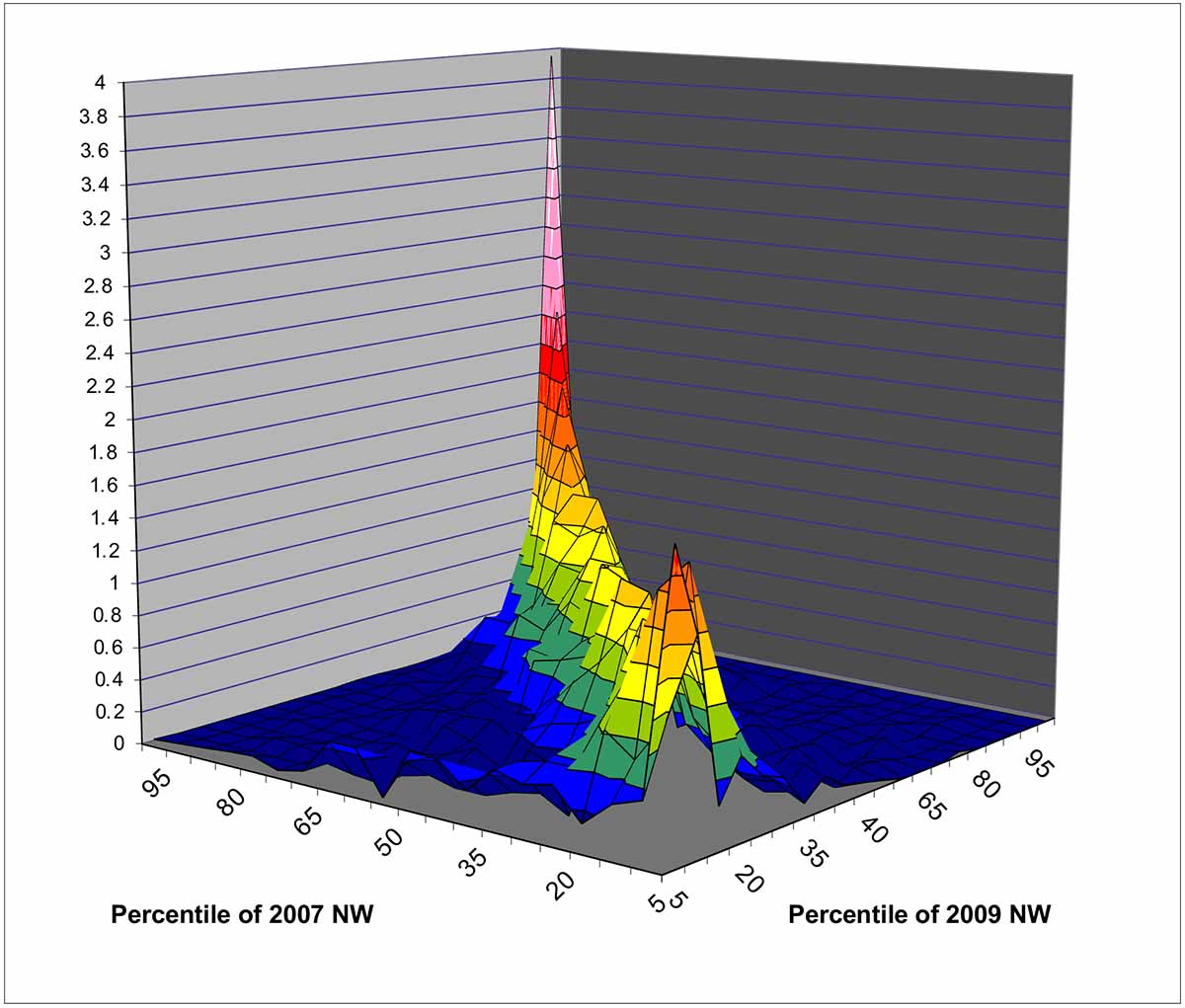
Exhibit 9: Density of changes in wealth, 2007–2009, SCF
It is always important to keep in mind that the conclusions we draw about inequality depend on the specific question or questions we bring to the data. I hope the material above has been sufficient to give some sense of this. At least as important is the quality of the data brought to bear.
The next post in this series will focus on questions related to wealth measurement.
Read More by Arthur B. Kennickell: