
Stone Center Affiliated Scholar Arthur Kennickell worked for more than three decades at the Federal Reserve Board and is best known for developing and leading the Survey of Consumer Finances (SCF). This is the first of a new series of three blog posts by Kennickell on the cross-sectional patterns of change in household wealth and income over a 33-year period beginning with the 1989 survey.
In this first post, he defines the measures examined and provides some high-level measures of change. The second and third posts will look in deeper detail at the shifts in the distribution of wealth and give a comparable picture of the shifts in the distribution of income.
By Arthur B. Kennickell
With the publication of the 2022 wave of the Survey of Consumer Finances (SCF), it is possible now to examine changes in household-level wealth (a term taken here to be synonymous with net worth) and income over the 33 years since the first comparable survey in that series, in 1989. All of the data in this post derive from the 12 waves of the public version of the SCF. Wealth is taken to consist of the net of all household assets and liabilities that are to a significant degree under the control of the household.[1] Income is taken to be the sum of the items that appear on the Internal Revenue Service form 1040, plus a measure of welfare benefits such as SNAP. The wealth figures are as of the time of each survey; the income figures are given for the previous calendar year before the survey. All dollar figures here have been adjusted to 2022 dollars, using the CPI-U-RS. No additional adjustments have been made for differences in the size of households.
The SCF is a cross-sectional survey, with only a very limited history of collecting longitudinal data on households. Because this series of posts focuses on changes over time as measured in this survey, it is important to keep in mind that the changes reported here are population-level estimates, not household-level estimates. There may be considerable churning of households within the wealth (or income) distribution to varying degrees over time.
For example, a household with wealth equal to the median value in 1989 may become more wealthy or less wealthy in 1992 than other households with equivalent 1989 wealth, and changes in wealth elsewhere in the distribution may shift the median point. Over such relatively short periods of time like this, it may be reasonable to expect that many households remain in approximately the same group; whereas by 2022 disparate outcomes and behaviors — such as receipt of large capital gains, additional saving and investment, dissaving to support retirement or the education of children, and entry of new households and deaths of old ones — make it much less likely that the initial position of households in the distribution would remain fixed. It is sometimes argued that very wealthy households tend strongly to remain very wealthy; while it is difficult to judge such persistence for a broad set of the wealthy, some sense of the degree of churn may be had from examining changes from year to year in the annual Forbes lists of the 400 wealthiest people in the U.S. Those data do show a substantial level of persistence by staying in the list, but over time there is also substantial entry and exit — as well as movement of position within the list.
To give an anchor in considering the distribution of wealth, Table 1 provides the values of wealth corresponding to each integer percentile point of the distribution in 2022. The table also shows the 99.9th percentile to suggest how rapidly the values increase at the top of the distribution. Above that point, the values escalate into the many billions of dollars. For this year, the values in the lowest 10 percent of the distribution are negative (debts exceed assets) or positive and not far from zero.
Table 1: Percentiles of wealth, 2022
| Percentile | Value | Percentile | Value | Percentile | Value | Percentile | Value |
| 1 | $-76,700 | 10 | $450 | 35 | $78,850 | 80 | $888,600 |
| 2 | $-45,700 | 11 | $1,000 | 40 | $110,030 | 85 | $1,242,100 |
| 3 | $-26,690 | 12 | $2,502 | 45 | $147,200 | 90 | $1,936,900 |
| 4 | $-14,970 | 13 | $4,000 | 50 | $192,700 | 95 | $3,795,600 |
| 5 | $-9,800 | 14 | $5,180 | 55 | $250,320 | 96 | $4,694,300 |
| 6 | $-4,620 | 15 | $6,500 | 60 | $312,560 | 97 | $6,178,000 |
| 7 | $-9,00 | 20 | $13,500 | 65 | $402,500 | 98 | $8,406,000 |
| 8 | $1 | 25 | $27,000 | 70 | $491,600 | 99 | $13,615,400 |
| 9 | $181 | 30 | $51,400 | 75 | $659,000 | 99.9 | $62,125,130 |
Figure 1 shows the times series of the share of households with zero or negative net worth, for 1989–2022. Up until the Great Recession (from approximately the end of 2007 to the middle of 2009), the proportion of households with negative wealth had been roughly the same: around 7 to 8 percent. The 2010 data show a considerable jump, which is only seen beginning to taper down in 2016 and only reaching a level about the same as the earlier level in 2022. An interesting detail that needs to be explored is the shrinking proportion with exactly zero wealth in the recent surveys. Households with negative wealth are a heterogeneous assortment. Typically, the group includes households that live at or close to hand-to-mouth, households of young people who have not accumulated significant assets but have debts such as student loans, and a relatively small group of households with large assets but even larger debts.
Figure 1: Percent of households with zero or negative wealth
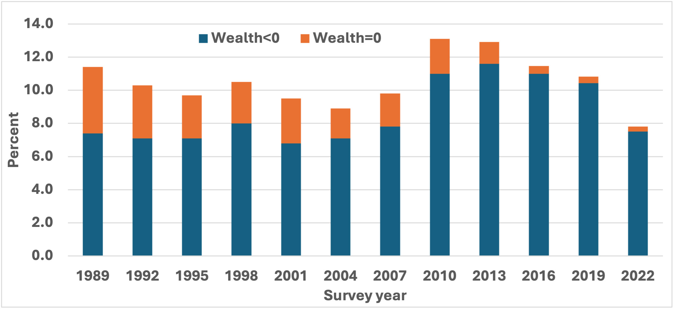
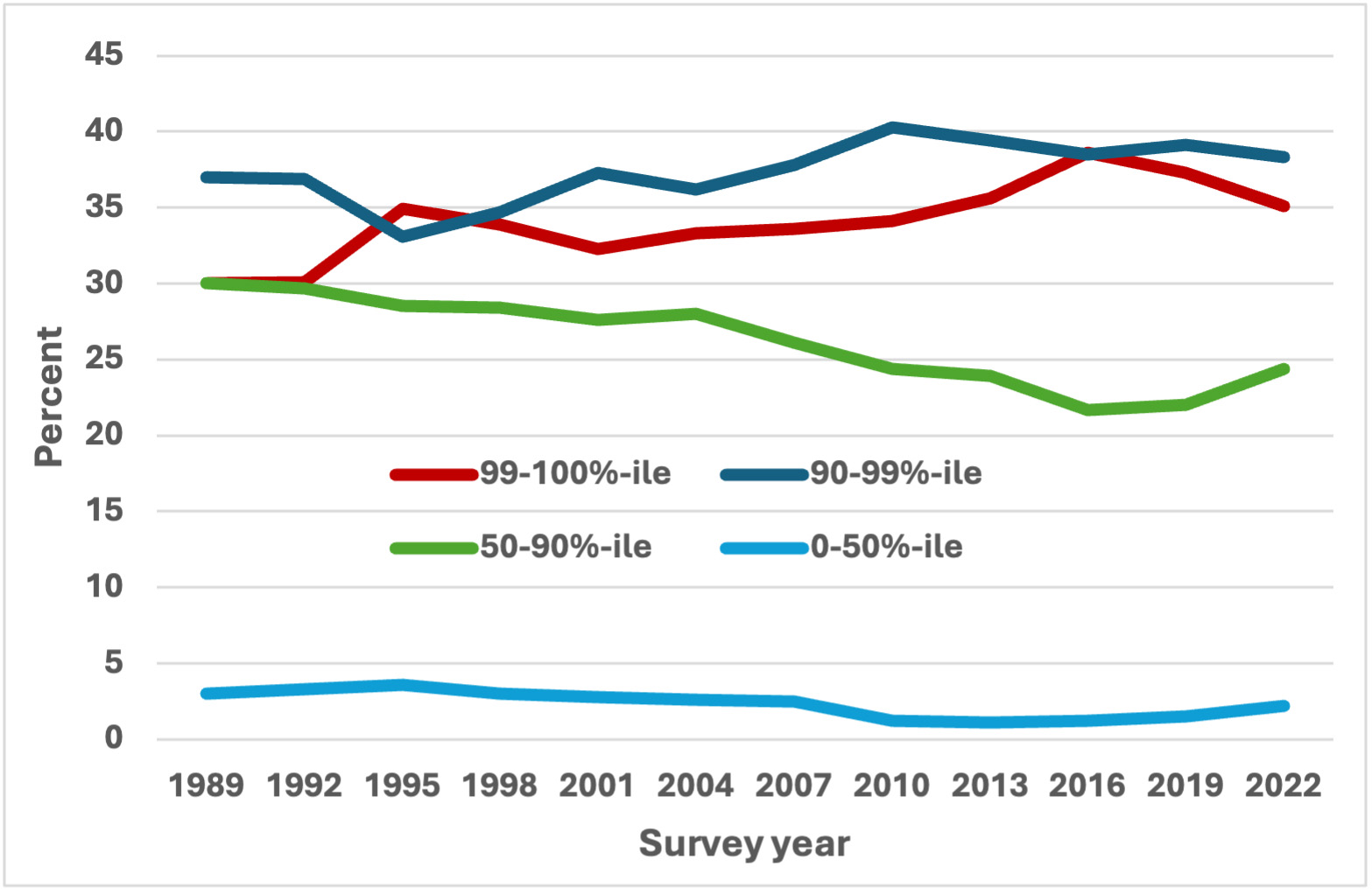
Figure 2 shows the percent of total wealth measured in the survey that is held by different groups defined in terms of their percentile rank in the distribution of wealth: 0-50, 50-90, 90-99 and 99-100. The most stark conclusion from the figure is what a tiny fraction of total wealth is held by the half of the population that is least wealthy — a figure that reached a maximum over the time considered of 3.6 percent in 1995. Paralleling the shift for households with negative wealth noted during the Great Recession, the wealth share of this least wealthy group fell even lower and only relatively recently began to show some recovery in their share. To me, the next most striking results are those for the “upper middle” group, those in the 40 percent above the middle of the distribution, relative to the two wealthiest groups. The wealth share of the upper middle group was on a declining trend from 1989 until 2016, at which point the share turned up only slightly before rising more strongly to 2022 — though even then only reaching about the level of 2010. Because the wealth share of the least wealthy group is so small, this change is necessarily largely driven by the combined results for the two wealthiest groups, which together held between about 70 and 80 percent of all household wealth over the time considered. The wealthiest group, “the one percent,” is very often the focus of discussion of wealth inequality. Although the two wealthiest groups each hold roughly the same share of total household wealth, obviously it is spread over 9 times as many households in the second-most-wealth group than in the wealthiest one. But taken together, it appears more that the groups may be moving noisily around a common, rising trend in the share, until the declines at the end of the period considered.
Figure 2: Wealth shares, by percentile group and survey year
To gain a comparable perspective on income, consider first the values of income corresponding to each integer percentile point of the distribution as measured in 2022, as shown in Table 2. Recall that the surveys collect income for the previous calendar year, so the income values in the table correspond to 2021. Although there are sometimes negative total income figures reported in the survey (usually a product of capital losses or business losses), the fraction in 2022 was well under half a percent of all households. As in the case of wealth, the amount of income above the 99th percentile does escalate dramatically, but with much less presence at the level of even hundreds of millions.
Table 2: Percentiles of previous calendar year’s income, 2022
| Percentile | Value | Percentile | Value | Percentile | Value | Percentile | Value |
| 1 | $4,540 | 10 | $20,537 | 35 | $48,641 | 80 | $151,328 |
| 2 | $8,215 | 11 | $21,618 | 40 | $54,046 | 85 | $189,160 |
| 3 | $10,809 | 12 | $21,618 | 45 | $62,693 | 90 | $248,610 |
| 4 | $12,971 | 13 | $22,699 | 50 | $70,259 | 95 | $390,209 |
| 5 | $14,052 | 14 | $23,780 | 55 | $79,987 | 96 | $464,792 |
| 6 | $15,133 | 15 | $25,942 | 60 | $90,797 | 97 | $546,941 |
| 7 | $16,214 | 20 | $31,346 | 65 | $102,687 | 98 | $742,586 |
| 8 | $17,295 | 25 | $36,751 | 70 | $115,658 | 99 | $1,199,812 |
| 9 | $18,376 | 30 | $43,236 | 75 | $129,709 | 99.9 | $4,885,721 |
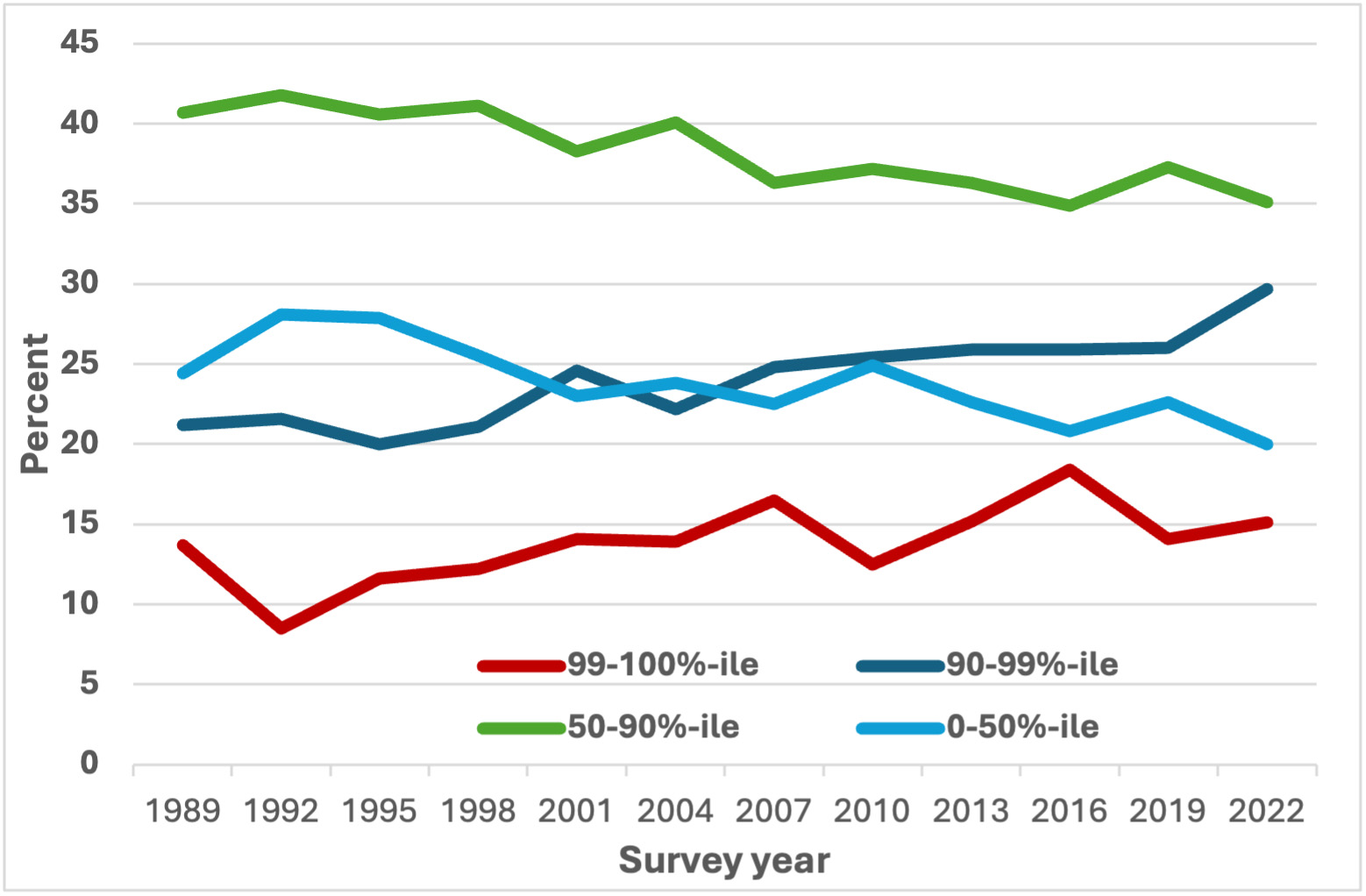
The shares of income received by percentile groups of the income distribution, shown in Figure 3 show a very different pattern in terms of the shares and the ordering of groups, compared with the corresponding results for wealth. In the 2022 data, the lowest-income group (0-50 percentile) received about 20 percent of the total (about 40 percent of an equal share of the total, compared with about 4 percent in the case of the corresponding wealth group), the upper-middle group (50-90 percentile) received about 35 percent (about 70 of an equal share, compared with about 60 percent for the corresponding wealth group), the second-highest-income group (90-99 percentile) received about 30 percent (more than 3 times an equal share, compared with about 4 times for the corresponding wealth group), and the highest-income group received about 15 percent (about 15 times an equal share, compared with about 35 times for the corresponding wealth group). But over the time considered, the patterns of change are similar: the shares of the lowest and upper-middle groups tended to decline, while the shares of the upper two groups have risen.
Wealth and income are positively correlated in the population, and the relationship tends to be strongest at the very bottom and the very top of the distributions. Nonetheless, there is considerable variability in where households might fall on one or the other distribution. But the details of this story will be for another time.
Figure 3: Income shares, by percentile group and survey year
Changes in wealth and income shares may say something important about changes in the distribution of economic power or control, but they may mask patterns of change in the levels of wealth that may feel to individual families more reflective of their changes in well-being over time. The second and third posts in this series consider, respectively, the changes from 1989 to 2022 in the levels of wealth and of income across each distribution.
[1] See www.federalreserve.gov/publications/october-2023-changes-in-us-family-finances-from-2019-to-2022.htm for the detailed definitions of income and wealth used here. Notably, the wealth measure includes retirement assets such as 401(k) accounts and IRAs, but not defined-benefit pensions and other income sources where there is no right to access an underlying asset. It is also important to note that the income measure includes realized capital gains, but not unrealized gains, which may be substantial.
Read More: