
May 30, 2024
Stone Center Affiliated Scholar Arthur Kennickell worked for more than three decades at the Federal Reserve Board and is best known for developing and leading the Survey of Consumer Finances (SCF). This is the final post in a three-part series by Kennickell on the cross-sectional patterns of change in household wealth and income over a 33-year period beginning with the 1989 survey.
By Arthur B. Kennickell
This is last post in a series on changes in wealth and income from 1989 to 2022, using data from the Survey of Consumer Finances. The first post examined various high-level measures of the distribution of household wealth and income. The second looked at the inflation-adjusted gains and losses across the wealth distribution. This current post applies some of the methodology of the second post to look at the patterns of change in household income.
As defined in the first post, the income considered is the sum of all sources of income for the year preceding the survey that can be reported on the IRS Form 1040, plus the amounts of government aid not treated as taxable income. The income amounts collected in the survey are for the calendar year preceding the survey year. These amounts have been adjusted here for inflation, but to remain comparable to the analysis of wealth, no adjustment has been made for differences in family size or composition. As in the second post, the aim here is to look at percentage changes in the amount of income associated with percentiles of the income distribution, separately defined for the baseline and comparison year.
It turns out that income changes viewed in this way can make for noisy graphs. Incomes reported in the SCF are very often reported as round numbers. Such reporting may reflect reality in some cases and in others it may show a level of approximation on the part of the respondents who provide the information. Using the same methodology as Figure 1 in the second post in this series, Figure 1 below shows the percentage change in income for just the 2016–2022 surveys relative to the 1989 survey. The spikiness of the lines here is obvious. Clearly, some modest smoothing of the data would make the underlying trends easier to see.
Figure 1: Percent change in inflation-adjusted income for previous year relative to 1989, for 2016–2022 SCF surveys, by percentile points defined independently for 1989 and the subsequent years.

Figure 2 uses lightly smoothed data to examine the change in household income recorded in the 1992-2022 SCFs, relative to the value in the 1989 survey. As with the figures in the second post, this figure is animated to show the pattern of all the changes together on one graph and the changes for each of the surveys taken separately.
Figure 2: Smoothed percent change in inflation-adjusted income for previous year relative to 1989, for 2016–2022 SCF surveys, by percentile points defined independently for 1989 and the subsequent years.
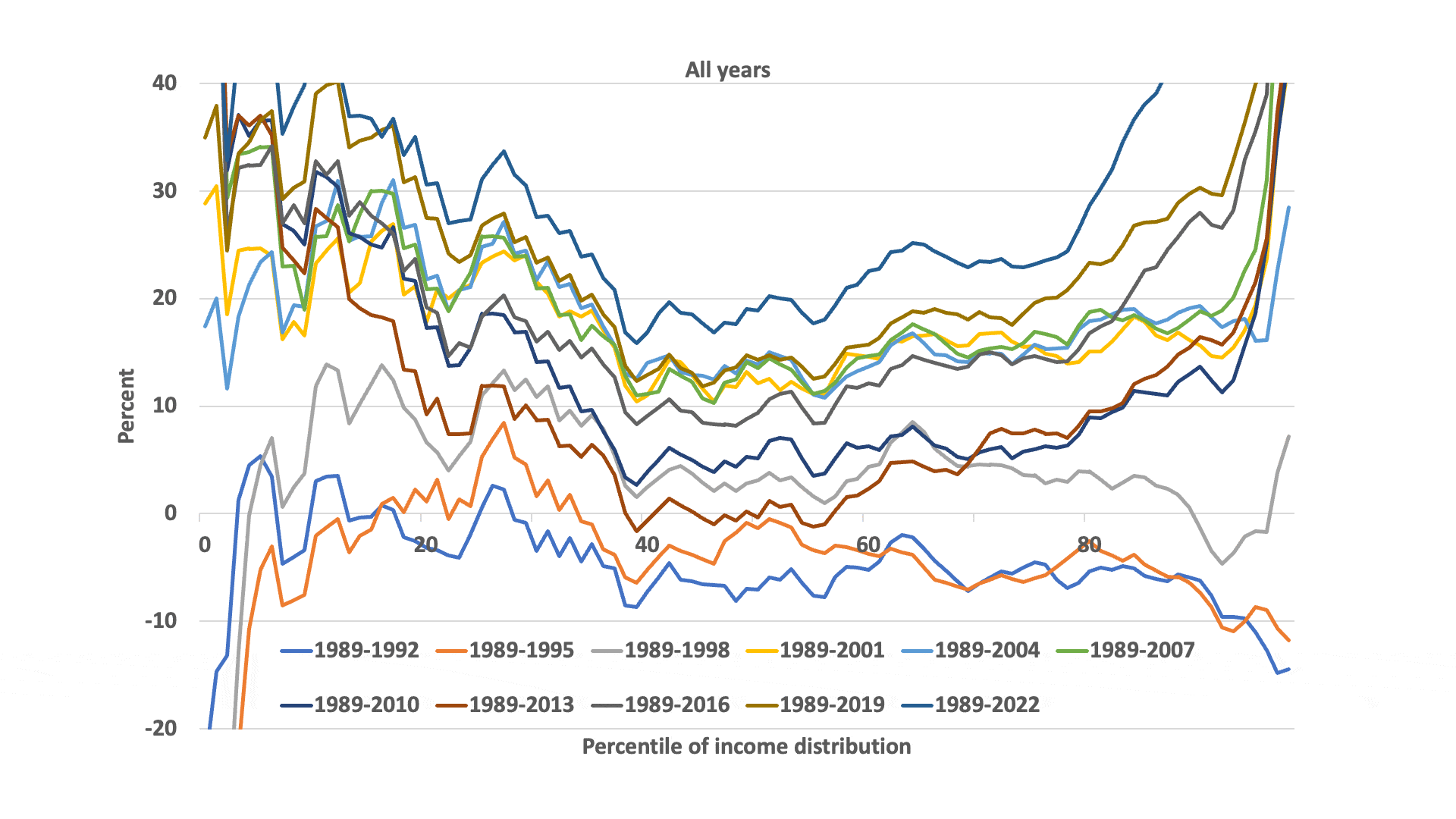
After a time of stagnation or worse though the 1995 survey, by 1998 there is a pattern of fairly broad growth relative to 1989, continuing through 2004. For the surveys after that, an overall pattern is clear: the cumulative growth across all those years tended to be far greater toward the top and the bottom of the income distribution than was the case for the middle of the distribution. For example, the aftermath of the Great Recession reflected in the 2010 and 2013 surveys is most evident in the collapse of cumulative gains for the center of the distribution, to a much more striking extent than for the two tails of the distribution, which retained more of the earlier gains. Though the cumulative gains at the middle of the distribution increased subsequently, the disproportion remained through the most recent survey in 2022. A similar outcome by 2022 holds for wealth, as may be seen in Figure 2 in the second post in this series.
As noted in that post, for a variety of reasons the households at various points in the distribution are unlikely to remain the same over time, and especially so over the 33-year period covered here. Considering survey-to-survey changes may give a better approximation of what groups of families may have experienced and it may also give a better way of connecting changes to other events. Figure 3 shows the smoothed percent changes in inflation-adjusted household income for the previous calendar year, across each of the neighboring pairs of SCF surveys from 1989 to 2022. In addition to some narration of the stages of the graphs, I also offer the reader some connections with the survey-to-survey wealth changes discussed in the second post.[1]
Of course, it is also important to keep in mind that households in a given position in the income distribution are not necessarily in the same position in the wealth distribution in the same period. Households toward the top or the bottom of one distribution are much more likely than other households to be in about the same position in the other distribution, but elsewhere there is much more dispersion, though there is still a positive correlation.[2] Wealth is affected by household behavior and events in the economy and the marketplace over time, implicitly adding an age component to wealth. On average, the age effect implies that wealth would tend to increase over time until retirement. In contrast, income does not cumulate in the same sense, at least for wage earners, so the dollar amount implied by a percentage change generally operates against a smaller base than is the case with wealth and especially so for many households in the upper half of the wealth distribution.
Figure 3: Smoothed percent change in inflation-adjusted income for the previous calendar year over pairs of SCF surveys, beginning in 1989, by percentile points defined independently for the two years.

- As noted above, from 1989 to 1992, nearly all the distribution showed losses in inflation-adjusted income. At the same time, as discussed in the second post, wealth showed some gain, but mainly for the part of the distribution below the 40th percentile.
- From 1989 to 1995, there was some modest growth, mainly between the 20th and 60th percentiles of the distribution. But the group below approximately the 20th percentile showed losses that were progressively larger toward the bottom of the distribution. The pattern of wealth changes from 1989 to 1992 largely continued here.
- Roughly paralleling the contemporaneous changes in wealth, between 1995 and 1998 there were broad and similar gains in income, with much larger gains at the very top and substantial losses at the very bottom. In contrast, for wealth, gains were stronger above the median.
- From 1998 to 2001, income again rose substantially, with approximately equal gains across the middle of the distribution and much larger gains at the top and the bottom of the distribution. The general pattern for wealth was also broad gains, which rose both above and below the median.
- Income and wealth changes from 2001 to 2004 show a very similar pattern of collapse in growth, reflecting the aftereffects of the tech crash. The changes in income were nearly zero across the distribution, except in the top and bottom few percentiles, where there were notable losses.
- From 2004 to 2007, growth in the center of the distribution remained near zero, but the two extremes of the distribution experienced sizeable gains. At the same time, wealth grew around the middle of the distribution and at the top.
- Following the Great Recession, as reflected in the changes between the 2007 and 2010 surveys, both income and wealth growth had collapsed again, though the patterns were different. Income growth was negative across the distribution, except approximately the bottom 10 percent. Wealth losses were greatest at the bottom of the distribution, with progressively smaller losses up to about the 90th percentile.
- From 2010 to 2013, inflation-adjusted income growth remained negative around the center of the distribution and rose only to about zero toward the top and bottom of the distribution. Wealth change was close to zero over this time, except at the extremes of the distribution.
- After about a decade of no gains (or losses) for the middle of the distribution, from the 2013 to 2016 surveys, income rebounded strongly and relatively evenly across the top approximately 80 percent of the distribution; growth was lower below that, and negative at the bottom of the distribution. Wealth change between the two surveys shows a roughly similar picture of change.
- The pattern of broad, but generally more modest, change across the middle of the income distribution continued between the 2016 and 2019 surveys; growth remained lower or negative at the bottom of the distribution and it also turned down at the top. Wealth change presented a very different picture, with growth highest below the median and trending downward toward the top.
- Finally, the two most recent surveys span the Covid-19 pandemic and the subsequent phase economic recovery: 2019 to 2022. The surveys show continued modest growth across the middle of the distribution, with higher growth toward the two tails; the growth of the upper tail is striking much higher: at about the 99th percentile, growth was more than four times larger than that at the median. Again, there is more of a disconnect with the pattern of wealth change; growth was markedly higher toward the bottom of the distribution, roughly even across the middle, and trending lower above the 90th percentile.
Overall, the patterns of income and wealth changes clearly have some degree of correlation, though often there are differences in which parts of the respective distributions gained or lost. Focusing first just on the changes relative to the 1989 survey, the shapes of the cumulative outcomes are similar: as expected, both show substantial growth, though the percentage gains were generally lowest around the median and gains were notably higher toward either side. By 2022, at the median the cumulative percentage gain in wealth far outpaced that in income. If all income were a return on assets, one might expect a somewhat more similar overall pattern. However, we also know that about half of personal income is attributable to employee compensation, and the proportion is larger below the top of the income distribution. A more detailed look at the evolution of the components of wealth and income over time may help in understanding the extent of differences in the patterns and extent of change.[3]
As noted several times by now in this series of posts, while the cumulative changes relative to 1989 can give insights into the evolution of the structure of wealth and income classes over time, they are likely to be less reflective of the felt experience of households, both because households may move within these distributions and because their impressions and decisions are often more responsive to relatively near-term events. Both the income and wealth distributions show a great deal of movement over time, with rates of growth rising and falling from survey to survey, even into negative territory, and with very heterogeneous movements for the various parts of the distributions.
For income, the periods with broad and substantial growth were 1995–1998, 1998–2001 and 2013–2016. Otherwise, except for the two most recent periods covered here, 2016–2019 and 2019–2022, where there was more modest broad growth, the broad center saw little or less than zero growth in income. Again, the general pattern for wealth was similar, but less clear-cut. Each change could be deeply explored in terms of various causative effects and social and possibly even political implications.
Here I focus more particularly just on changes measured in the most recent interval of the SCF surveys, 2019–2022. Figures 4a and 4b show the same information in Figure 3 from this post and Figure 2 from the second post, but just for this period. Although the 2022 data are about two years old as of the time of this post, this is the best information we have on the distribution of both income and wealth for the near term.
Figure 4a: Smoothed percent change in inflation-adjusted household income for the previous calendar year, 2019–2022, by percentile points defined independently for the two time points.

Figure 4b: Percent change in inflation-adjusted household wealth, 2019–2022, by percentile points defined independently for the two time points.
From these measurements, we may gain some insight into the current “economic mood” of households. This period stands after earlier erratic patterns of change already discussed here, and it covers the time of the Covid-19 pandemic and the beginnings of its aftermath. As noted, the data show relatively modest income growth (around 1.7 percent on an annualized basis) across the broad middle of the income distribution and a strikingly larger range of increases for the upper 20 percent of the income distribution. There was also some greater growth at the lowest percentiles, though the picture is the opposite for the next 10 highest percent.
Over this time, we see wealth gains much larger than those for income across the middle of the wealth distribution, with far larger gains below the middle and much smaller gains at the top.
Given the portfolio holdings of the top group, which are heavy in businesses and publicly traded financial assets, it seems likely that more current data would show much larger gains for that group; stock market prices had reached a near-term trough around the time the 2022 survey data were being collected. For the least wealthy group, the positive part of their wealth is relatively likely to be in the form of vehicles and bank accounts, rather than real estate or other financially sophisticated assets. The remains of stimulus payments received over the pandemic and the growth of used car prices over this time may explain at least part of the increase. The former, at least, might be considered as contributing to somewhat greater financial security for these households; the latter might be taken as signaling higher expected future replacement costs. For the broad middle of the wealth distribution, a residence is generally the most substantial asset by far, though retirement accounts of various types may also be an important portfolio element. The strong upward movement of house prices over this time very likely explains most of the wealth increase for the group. Although it is possible that many households had the potential to tap home equity increases through borrowing, higher interest rates may have dampened the incentive. In any case, there is little sign in the data that there was a big increase in such borrowing.
How might perceptions of inflation affect how households view changes in their situations? Since the pandemic, perceptions of inflation measured in surveys has run above the official figures.[4] Inflation, at least in economists’ terms, is an abstract concept. Depending on what approach is taken to measure it, the measure combines changes in prices and a broad market basket of actual, adjusted, or implicit expenditures. As many others have noted, for the behavior of most individual households, it appears likely that price changes for items purchased often are a more salient factor than the official inflation rate.
Official inflation figures attempt to incorporate a measure of the flow of use from assets such as houses and automobiles, using methods that it might not be reasonable to expect many households to use in their own assessments of inflation. One possibility is that households may look at price changes for this class of assets and incorporate some part of those changes into their sense of experienced inflation. Given the relative importance of such assets for households below the top of the wealth distribution, depending on how strongly households respond in this way to the shifts in asset values, the result for the broad middle of the income distribution may be a greater perceived inflation that would reduce the experience of the modest real income increases, as calculated using the official inflation rate. For the two ends of the income distribution, where income increases were larger, this would be less of a factor in any case. Households with recent borrowing interests/needs or variable-rate loans may also have responded to the increase of interest rates over this period (and continuing into the current period) as an additional input to their perceived inflation. For now, these possibilities are speculative. More definitive analysis awaits further behavioral research.
[1] As noted in the second post, the analysis of change in wealth was restricted to the upper 85 percent of the distribution. See that post for details.
[2] For a detailed discussion of the relationship between income and wealth in the SCF, see my paper “Ponds and Streams: Wealth and Income in the U.S., 1989 to 2007.” Figure 18 in that paper is a graph of the correspondence of income and wealth percentiles, using data from the 2007 SCF.
[3]Possibly the subject of a future post.
[4] See David Lebow and Ekaterina Panera (2024), “Inflation Perceptions During the Covid Pandemic and Recovery.”
Read More:
- Changes in Household Wealth and Income, 1989–2022: Part 2, by Arthur B. Kennickell
- Changes in Household Wealth and Income: 1989–2022, an Analysis by Arthur B. Kennickell, Part 1 in this series.
- What Means Can Be Used to Measure Wealth? By Arthur B. Kennickell
