May 9, 2024
Stone Center Affiliated Scholar Arthur Kennickell worked for more than three decades at the Federal Reserve Board and is best known for developing and leading the Survey of Consumer Finances (SCF). This is the second post in a new series by Kennickell on the cross-sectional patterns of change in household wealth and income over a 33-year period beginning with the 1989 survey.
By Arthur B. Kennickell
The first post in this series described the data used in this series of posts and laid out some high-level information about the shares of wealth or income held by various subgroups of households, defined by their positions in the overall distribution of wealth or income. In this post, I describe the changes in the levels of household wealth across the distribution. Arguably, changes in their level of wealth are likely to be more salient to households than their relative position.
Because the level of wealth and its change vary so much in dollar terms across the distribution, it would be difficult to show such changes graphically, given the constraints of this medium. The approach taken here is to show the changes as a percentage increase or decrease of a baseline value. But one problem with this approach is what to do about values that are close to zero, exactly zero, or negative. Obviously, if the baseline value is zero, the percentage change is undefined. For baseline values close to zero, small dollar changes can appear as very large percentage changes. For negative baseline values, increases show up as negative changes and decreases show up as positive ones; this could be addressed by taking the absolute value of the baseline. The more important issue for negative values is the great noisiness of change within this group. It may be more informative to consider that group more directly.[1] The compromise taken here is to focus on the upper 85 percent of the wealth distribution; this choice ensures that values very close zero are omitted in all the years of data considered.
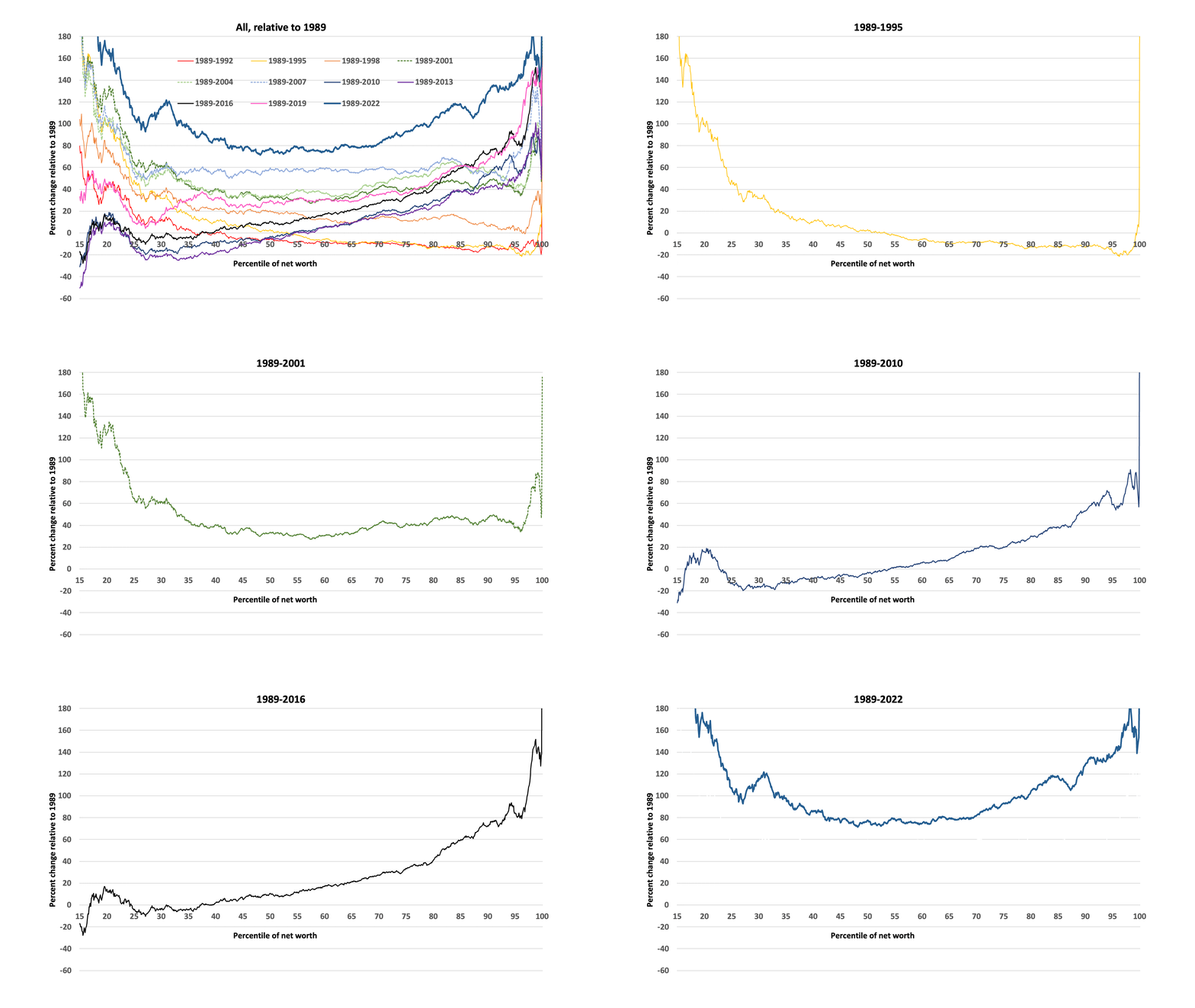
I take two approaches here. First, I consider the change in inflation-adjusted wealth for each of the SCF surveys from 1992 to 2022 at each point in the distribution above the 15th percentile, relative to the 1989 value at the same point in the distribution for that year. Formally, the change is given by 100 * (Wt − W1989)/W1989, where W represents wealth and t ranges from 1992 to 2022 in three-year intervals.
As various events affect the life of a household from year to year, the likelihood that a household will remain at exactly the same point in the wealth distribution decreases over time. By 2022, the cumulation of 33 years of such events would make it very likely that substantial change will be evident. Moreover, given births and deaths, the overall set of households also changed. For these reasons, wealth changes viewed in this way are best taken to represent a sort of “societal level” view of changes in the condition of the groups of households at a given levels of relative advantage in terms of wealth.
The changes are shown survey-by-survey (and in a summary graph containing all the years) in Figure 1 below. As you will see, the figure is animated to show the series of changes. I encourage you to cycle through the images several times, and then pause to look at each year more carefully. As defined in the first post, net worth is a term taken here as synonymous with household-level wealth. All figures are adjusted to 2022 dollars. Download Figure 1.
I offer you some general narration of approximate patterns, in hopes I can make it easier for you to process the information in the images:
- From 1989 to first 1992 and then from 1989 to 1995, the general pattern is that growth was progressively stronger below the median, nil or slightly negative above that, until the top of the distribution, where growth was very strong.
- From 1998, there begins to be evidence of growth relative to 1989 across that middle part of the distribution, though the patterns of relative growth on the ends are much stronger.
- Then, from 2001 to 2007, the most striking pattern is the continued growth across the broad middle of the distribution, relative to 1989.
- The 2007 data were collected on the cusp and into the very early part of the Great Recession, so the 2010 data are the first to show the aftereffects of that crisis. The 2010 data show that the wealth gains relative to 1989 were nearly all erased for the range below the median, and progressively spared in the range above that.
- The patterns for 2013 and 2016 are about the same as for 2010.
- In 2019, the data show a slow return of growth across the distribution, with growth strongest in the upper quartile.
- By 2022, the data show strong and broad growth relative to 1989, with the middle of the distribution finally surpassing the level of 2007, and the upper and lower parts of the distribution showing more growth than the middle.[2]
To me, the most striking fact across these years is not the rise of the very top of the distribution, which we can see more easily in other ways. Rather, it is the growth and then collapse, and more recently of growth of wealth relative to 1989 for the broad middle of the distribution.
Figure 1: Percent change in inflation-adjusted wealth relative to 1989 for subsequent surveys, by percentile points defined independently for 1989 and the subsequent survey years.
As noted above, the results so far apply strictly only at the level of groups of the population, where the group composition very likely changes considerably over the long time considered. We might also want to know about the range of outcomes over time for households that begin at a particular point in the wealth distribution; this may be especially important in understanding social attitudes about fairness, opportunity, political stability, etc. But without panel data on individual households, we cannot directly examine the range of evolution of such households over time. However, if most households do not dramatically change position in the wealth distribution over the three-year interval between pairs of SCF surveys, we can at least give an indication of the “typical” change that households at a given position in the wealth distribution might have experienced.
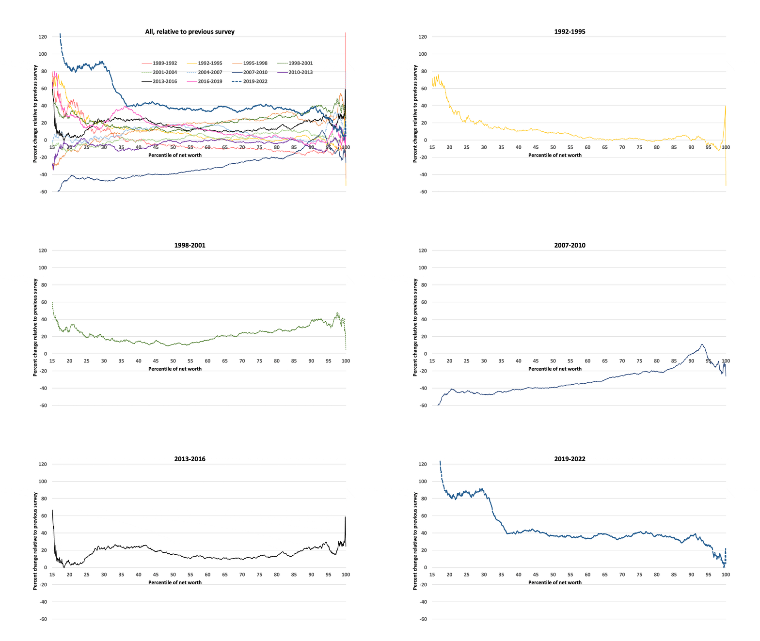
Figure 2 shows the survey-to-survey changes in wealth across the upper 85 percent of the wealth distribution. Formally, at each percentile point, the value shown is given by 100 * (Wt − Wt−3)/Wt−3, where t ranges from 1992 to 2022 in three-year increments. Download Figure 2.
Figure 2: Percent change in inflation-adjusted wealth over pairs of SCF surveys, beginning in 1989, by percentile points defined independently for the two time points.
As in the case of Figure 1, some narration of the patterns of change may be helpful in grasping the content of Figure 2:
- Of necessity, the change from 1989 to 1992 is exactly the same as in Figure 1. We see strongest growth in wealth in the range shown below the median and at the top of the distribution. At some points below the top, the data show losses.
- From 1992 to 1995, wealth growth is highest at the lower part of the distribution displayed, tapering to around zero at the 65th percentile, and showing negative change just below the top of the distribution and a positive spike at the top, smaller than over the previous interval.
- In contrast, the change from 1995 to 1998 is broadly positive and substantial in the upper half of the distribution aside from the very top, progressively less so below that, and negative below the 25th percentile.
- From 1998 to 2001, growth was spread across the whole part of the distribution shown, though with less growth toward the middle of the distribution and at the very top.
- The bursting of the tech bubble and related economic adjustments are reflected in the near-flat line of change from 2001 to 2004.
- From 2004 to 2007, growth is concentrated around the center of the distribution and the top 7 or 8 percentiles.
- The change from 2007 to 2010 captures the very strong economic effects of the Great Recession, starting in late 2007 and running (officially) to mid-2009. There were substantial losses, though of decreasing percentages, toward the upper part of the distribution; only a region around the 90th percentile showed any growth.
- The changes for the 2010–2013 period look much like those for the 2001–2004 period after the tech crash: relatively little change throughout the distribution.
- There was a return to fairly broad growth between 2013 and 2016, with a spike at the top.
- From 2016 to 2019, growth is largely tilted to the lower part of the distribution shown.
- For 2019 to 2022, the time from just before the Covid-19 pandemic into the time of resumed economic activity, the data show very strong wealth growth in the lowest part of the distribution shown, approximately equally strong growth from about the 35th to the 90th percentile, and notably lower wealth growth at the top of the distribution.[3]
What is most striking to me is the degree of variation from period to period in the patterns of growth or loss. The observed wealth data end on a seemingly relatively optimistic note for narrowing inequality, with the greatest percentage gains going to the distribution below the top. Of course, as may be seen from Table 1 in the first of this series of posts, the differences in wealth levels remain enormous.
The next and final post in this series will consider the changes in income over the same period.
[1] See my paper: “The Other, Other Half: Changes in the Finances of the Least Wealthy 50 Percent, 2007-2009”
[2] Because the 2019 and 2022 surveys bridge the Covid-19 pandemic, the data cannot directly characterize what happened to wealth during that interval. Whether the change observed by 2022 is a reflection of transitory factors related to the pandemic or other factors should be easier to understand once the 2025 SCF data are available.
[3] It is worth pointing out that in the case of both Figure 1 and Figure 2, the graphs cannot adequately reflect what happened in the most highly concentrated part of the wealth distribution, the region above the top 1 percent. To do so would require expanding the size of the region of the graphs for this group well out of proportion to the rest of the distribution. Detailed study of this wealthiest group is better accomplished in other ways.
Read More:
- Changes in Household Wealth and Income: 1989–2022, an Analysis by Arthur B. Kennickell, Part 1 in this series.
- What Means Can Be Used to Measure Wealth? By Arthur B. Kennickell
- Wealth, Inequality, and Measurement, and the GC Wealth Project Website: Arthur B. Kennickell
- What Do We Mean by Wealth Inequality? A Framework by Arthur B. Kennickell


